Learn More about America’s Most Notable Road & Traffic Signs
27th Jul 2021
There are many notable road signs that will go down in history. From the beautiful landscapes on Wyoming's new welcome signs to the most-stolen road sign welcoming visitors to go to Hell, MI, you can find examples of fun, crazy and even frightening signs meant to guide motorists.
Route 66
Some of the first road trips and the country took place after Route 66 opened. Created by the Bureau of Public Roads in 1926, this highway brought together state and local roads to connect Chicago to Los Angeles.
Gas stations, motels and shops sprouted up along the route and fed local economies. Route 66 is an enduring beacon of American car culture, and the bold font of Route 66 signs matched the spirit of early cross-country travelers.
Directional Signs
Squiggly lines indicating a curvy route, a sign randomly tacked to a tree in the shape of a question mark, and oddly shaped arrows are just a few examples of road signs that have gone awry.
There's nothing wrong with a clever sign, as long as it clearly communicates the road conditions or directional information required by passing motorists. From the iconic Hollywood sign to the refurbished welcome to Las Vegas sign that still dots the old strip, many road signs have become memorialized into our cultural memories.
Tips for Designing Clear Road Signs
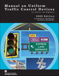
The Manual on Uniform Traffic Control Devices (MUTCD) lays out the basic rules for road signs. Federal highways as well as most state and local roadways contain signs that adhere to the MUTCD.
Signs that are hard to understand distract drivers and can cause accidents. So, signs that warn about weather conditions, anomalies on the roadways and other issues must be absolutely clear at a glance. Effective signs catch viewers' attention and quickly convey the required information.
The following qualities are important for designing an effective sign:
- Visible
- Legible
- Non-distracting
- Clear messaging
- Easily recognized
You can improve the layout of the sign by placing arrows in the proper orientation. Also, keeping the focus of the sign in the center makes it easier for drivers to scan the sign quickly.
Using all caps and a san serif font can increase the readability of signs. Additionally, lettering needs to be large enough to view from a distance as drivers approach the sign.
If you need help designing your signs, the experts at Dornbros Sign and Safety are here to help. We can help you create notable signs that have character without crossing the line and compromising readability and safety.
From vintage and novelty signs to putting a fresh spin on signage, we can ensure that you adhere to local, state and federal sign regulations. Contact us today to discuss the signage needs of your HOA, municipality, private property or other organization.


